


Google revamped Android’s look with a new colour scheme in Android 12. However, Android 15 might not have such a major update. Yet, it could bring one of the biggest changes to how Pixel phones’ Android looks.
Found in Android 15 Developer Preview 2, there’s a hint that Google may change the icons at the top of the screen to look more like Samsung’s, which they’ve used for a long time.
In the developer preview, you can find secret settings that reveal new designs for the battery, Wi-Fi, and cell signal icons. Instead of solid shapes, these icons are now divided into parts, using shades of grey and white to show the strength of your connection.
The battery icon is also changing from upright to sideways, allowing the battery percentage to be shown inside the icon. If you prefer the old style, you have the option to switch it off.
![]()
Since Android 5 Lollipop, when Material Design was introduced, the look of the status bar hasn’t changed much, keeping its simple icon style. There was a small update in Android 10 where you could choose from a few different icon styles, some of which are like the ones in the Android 15 preview.
But, this choice was removed in Android 12. Considering this, Android 15 might bring back some of these options, or Google might be planning to change the design for all Pixel users.
In Android 15, Google is adding more vibration feedback. When you press or press and hold a quick setting button in the notifications area, you’ll feel a slight buzz. Similar to the brightness control, you’ll also get this vibration when you change the volume using the on-screen slider after hitting the volume button on your phone.
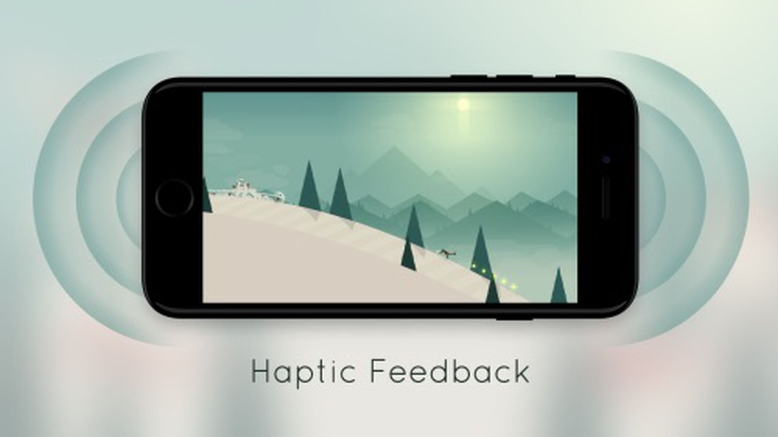
Because the new icons and vibration feedback aren’t out yet, they might change a lot or not be in the final version. Google might have finished these features but could be waiting for the first Android 15 Beta to show them off. Even then, the icons and feedback could change a lot before the final version comes out later this year.
What do we think?
I think Android 15 is going to shake things up a little, especially for Pixel users like us. The new icon styles, taking a leaf out of Samsung’s book, sound pretty cool. I like the idea of having more detailed battery and signal icons.
It’s neat that the battery icon might go sideways to fit the percentage inside – that’s super handy. The added vibration feedback for quick settings and volume changes is a nice touch too. These aren’t huge changes, but they could make the phone feel fresher.
Still, I’m curious to see if these features will make it to the final release. It’s all up in the air, but I’m excited to see what sticks!